
Account Manager Workspace:
One Hub to Drive Growth and Insight
WEB DESIGN / USER RESEARCH / DARK MODE / AI INTERGRATION
.png)
01
Project Overview
Timeline
2 Months Interview / Incrementing Workshops / On-going Design
My Role
UI/UX Designer
Constraints
Cross-functional Teams
Lack of testing resources
Changing requirements
Short turnaround
Multi-channel communications
Problems
Account Managers work with Amway's top leaders. However, the tools supporting them were anything but elite. Between Excel reports, outdated dashboards, and scattered systems, AMs were losing valuable time trying to piece together information. The previous tools available weren't just inconvenient, they were barriers to partnership.
Goals
We aim to provide AMs with an easy-to-use, actionable, and streamlined tool for improving verifications to consultants.
Our goal is to create a single source of truth that will empower Account Managers to proactively improve Leaders’ businesses, providing them with the most efficient solutions to help them truly become the bridge to Leaders' success.
02
Research
To fully understand who the users are, we conducted rounds of interviews across 4 different markets with 10 Account Managers.

Who are Account Managers?
Account Managers are dedicated consultants who help top-level ABOs (Amway Business Owners) grow their businesses.
They analyze KPIs, build business plans, approve qualifications, and provide strategic guidance across markets.
How do they work?
Unlike most roles, AMs don't operate on a daily schedule, their workflow is monthly, broken into beginning, mid, and end-of-month milestones.
Tasks range from data collection to plan creation, and vary slightly by market.
Top Pain Points
Through interviews, we heard consistent frustrations across the board:
01 / Too many tools & inconsistent data
02 / Manual processes & time-consuming tasks
03 / Lack of unified training or support
04 / Slow system performance
05 / No streamlined approval flow
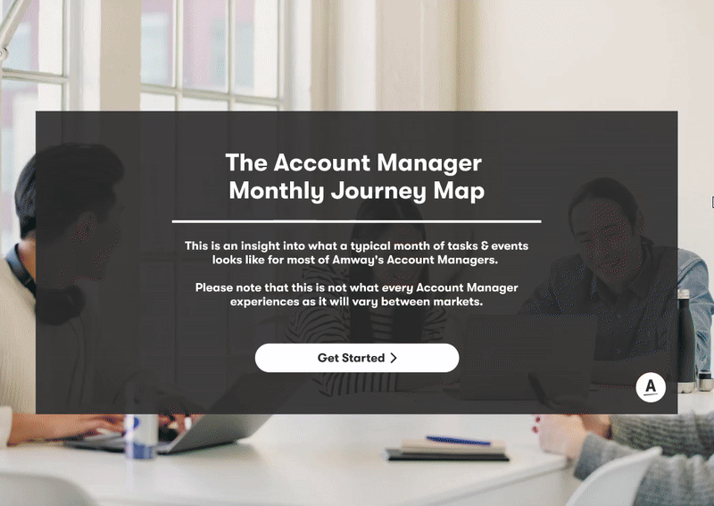
Radial Journey Map
To synthesize our findings, we created a radial journey map that visualized the AM's full monthly cycle, from qualification checks to business planning.
Based on the events, we also listed potential opportunities that could help with building the blueprint of the workspace.
Summary
This research phase gave us a clear, human-centered starting point. AMs needed more than a tool, they needed a centralized, reliable workspace that matched their rhythm, removed friction, and gave them time to focus on people.
Opportunity
The real opportunity wasn't just to build a better tool. It was to rethink how Account Managers approach leadership support. Could we design a workspace that predicted needs, surfaced key leader trends, and made business coaching feel seamless?

.png)
03
Challenges
WHAT WE LEARNED FROM OUR USER STUDY
Account Managers had to cross multiple sources to navigate information and data. It was very difficult and time consuming to bring insights and report to leaders .
To validate the pain points, we started by looking into the existing tools. By getting access to the tools and talking with Account Managers, I summarized a list of challenges we faced.
At the same time, I started doing benchmarks, to determine some great examples of current solutions, so we could define gaps and opportunities.

Example of Benchmark and Comparison

Example of Current Solutions

Whiteboard ideas and initial brainstorms
Benchmark research helps the team fill in gaps between existing experiences and our workspace, as well as learn from the experts on data presentation and efficient work structures. From there, we came up with more grounded solutions.

The Challenge
Scattered data in multiple tools that might not be accurate.
Let's solve it by...
Centralizing and prioritizing the key data and features in our platform.
The Challenge
Interactions are not intuitive, information is dense and overwhelming.
Let's solve it by...
Providing consistent UI and easy interactions. Condense and summarize information.
The Challenge
Tools are not smart enough, no insights or actionable tasks.
Let's solve it by...
Providing insights, actionable tasks, and data predictions.
FIRST ATTEMPT: EARLY VERSION LEARNINGS
Since we did all the research, can we come up with the dashboard right out of the gate? :)
As we wrap up the initial research phase, I’m feeling even more excited about visualizing what the dashboard can become. I’ve started drafting wireframes with input from the Global Sales team.

Things didn't go as expected...
Misaligned Purpose / The Workspace should work be more insight driven, than event management oriented.
Missed Daily Priorities / The dashboard didn’t support their actual start-of-day tasks, AMs usually start from their assigned accounts.
Key Data Got Lost / Crucial insights weren’t highlighted, making it hard to find what really matters.
Overloaded Layout / Elements like tasks, calendars, and notifications lacked hierarchy or clarity.
Too Many Assumptions / The design didn’t reflect real AM workflows—just product guesses.
We quickly realized putting the cart before the horse is not a smart idea. What we should do is build from the ground up, re-visit all the data and insight we gathered during research.
TIME TO SHIFT GEAR
Learning from the first attempt, we shifted our strategy to incrementing releases with realistic designs, rather than building off of a future state.
Building something that integrates multiple channels is no small feat. I realized the most realistic way to tackle this challenge was to break it down step by step. We should start with a rough site map, redesign key pages one by one, and move from wireframes all the way to high-fidelity designs.
.png)
04
Solution
The Growth of Workspace
Improving the Layout: From "List" to "Logic"

[After] Release 2+ Layout
We quickly realized our initial navigation wasn't going to scale. With pages just stacking on top of each other, the workspace became a bit of a maze for users. We needed a cleaner, more organized way to move around.
I explored a few layouts and settled on a flexible side nav. By making it collapsible, we gave users control over their screen real estate while keeping the hierarchy clear. To pull it all together, we also focused on refining the light and dark mode styles to ensure the UI felt polished regardless of the theme.
The Growth of Workspace
Enable actions and expectations to the “Goal” page

[After] Release 3+
Our Beta release of the Goals page was intentionally minimal, but feedback quickly showed that "basic" wasn't enough. Without trackable metrics or clear actions, the page couldn't support the high-level business discussions AMs were having with their leaders.
Hearing from the AMs made us realize just how much potential the Goals page actually had. The AMs needed more than just a list; they needed a way to drive conversations with their leaders. I redesigned the page using a structured tile system that prioritizes actionable metrics. Now, AMs can track real progress and update statuses in real-time. It’s no longer just a page to check—it’s a record of growth that keeps their business consultations focused and productive.
The Growth of Workspace
Export and view Leader’s profile at a glance.

[After] Release 3+ Layout
The first iteration of our leader info page was a "functional" dump of data, but it lacked hierarchy. It was hard to scan at a glance. During Beta, we realized AMs needed a tool, not just a document.
I stepped back to reorganize the entire page for readability. I used accordions to manage the data density and built a stronger visual hierarchy so key metrics jump out immediately. Adding an export button was a small change that aimed to make an impact on the AMs' daily workflow.
I enjoy the process of bringing order to this kind of "un-flashy" functional page. It brings clarity to complex information and helps AMs better understand the leaders they work with, ultimately strengthening those relationships through context and insight.
05
Design "Revolution"
Part 1
Into the Dark: Setting up the first Dark Mode system in the organization
From the initial research phase, all the way to building and enhancing an entirely new library of color tokens and responsive components.

Impact of Dark Mode
The introduction of dark mode to the AM Workspace demonstrates our core team's commitment to creating a user-centered experience that adapts to real-world usage patterns.
The foundation our team laid sparked interest across other teams; the success of our implementation has led to requests for dark mode across other products. Establishing our design system as the template for dark-mode interfaces throughout the organization.
Part 2
Leveraging AI to empower AMs
As part of our initiative to streamline the Account Manager experience, we introduced AI-powered tools to support faster decision-making and reduce manual workload.

01 / AI-generated Insights
Extracting key performance signals from data-heavy pages like the Business Performance page.
03 / Data Consolidation with IE
Intelligence Engine (IE) reducing dependency on external tools by making information more readily accessible within one platform.
02 / Automated Data
Turning raw monthly/yearly performance into leader-focused narratives.
04 / Qualification Prediction
Streamlining prediction models based on KPIs to help AMs focus on groups on top of the priority list.
06
Outcome and Impact
Set up standard and guidelines for Dark Mode
Built a comprehensive guide in design tokens and design libraries for other designers.

Strengthen the relationship between Individual Business Owners and Account Managers
From business insights to report exports, we encourage a stronger connection between IBOs and AMs.

Initiate the topic of AI: From chat to connection
Conversational AI isn’t exactly the only thing we are looking for. We enable the companion style of the engine for insights and recommendations.

Streamline the multi-channel verification process to lift AM’s workload
Re-designed the flow of the complicated verification process to help AMs work more efficiently.

.png)
07
Reflection
Speaking up for Design
During this whole process, I realized how crucial it is to actively receive support from the internal team. The development process is a fast-paced environment focused on meeting deadlines and building features; taking the time to make personal connections allows us to capture real-time usability moments that can shape the workspace more intentionally. Without the proper support, we are not able to get feedback that showcases measurable success criteria. In the future, I would like to have regular meetings regarding user feedback. The meetings would serve as a continual checkpoint to mark progress throughout future iterations.
Diving into the numbers without a map
Entering this project meant stepping into a world of complex business models and metrics, without a background in data or analytics. It was overwhelming at first. With a fast turnaround and constant momentum, there were many moments I wished I had slowed down to ask more questions and dig deeper into the “why” behind the numbers.
What began as uncertainty quickly became an opportunity for growth. Immersing myself in the data taught me how essential it is to connect design decisions to business strategy, illustrating just how powerful user-centered design can be when grounded in real metrics.
As an outsider looking in, I learned to navigate ambiguity with curiosity. I learned to ask better questions, propose rational solutions, and stay creative when the answers weren’t obvious. Bringing a fresh perspective to such a structured, analytical space challenged me to think differently, and reminded me that sometimes, being an outsider is exactly what fuels innovation.
