AI Visual Identity:
An Organic Mark for Infinite Intelligence
GRAPHIC DESIGN / ILLUSTRATION / LOGO DESIGN / WORKSPACE INTERGRATION


01
Project Overview
Timeline
3 Weeks
My Role
Visual & UI/UX Designer
Constraints
Complex Stakeholder Alignment
Need for Convincing Design Rationale
First-Time Logo Design Pressure
Limited Experience with Graphic Design Tools
Uncertainty of Final Implementation
Why is it important?
AI technology has rapidly evolved and is becoming an increasingly common tool across digital products. As AI-powered features begin appearing more frequently in interfaces, it becomes important for users to clearly recognize when intelligent systems are supporting their experience. Unlike traditional UI elements that users are already familiar with, AI features are still relatively new, creating a need for clear and intuitive visual cues within the product.
To address this, the team explored how to represent Amway Intelligence through a distinct AI logo. The goal was to create a visual identity that signals the presence of AI within the interface while remaining aligned with company’s brand system.
Through research and design exploration, we identified key elements that influence the symbolic meaning and overall look and feel of the logo. We aimed to create a mark that fits the brand identity while communicating the innovation and intelligence behind the technology.
As more products introduce AI-powered features, many attempt to communicate “this icon represents AI” through their own visual approaches. Although this experimentation has only recently begun, several consistent patterns are beginning to emerge. These patterns generally converge across three key areas: Shape, Color, Microcopy.
02
Research
Shapes
The “sparkles icon” has almost solidified its place as the standard visual cue for AI features. Yet, an interesting trend emerges: none of the key players leading the AI revolution are actually using this symbol. The AI frontrunners — ChatGPT, Claude, Amazon, Perplexity, Copilot, and Meta, seem to be deliberately avoiding this iconography, which has been organically adopted by a wide range of smaller products.

Colors
A clear trend in color selection has emerged across various AI products.
One noticeable visual approach is the prevalent use of gradients, often within a specific range of colors: shades of blue to purple or magenta.
Warm colors, on the other hand, are relatively rare. The majority of adopted colors lean toward cooler tones.
Cooler colors, especially blues, are often associated with trustworthiness, which could tie directly to the perceived reliability of AI-generated information.
Gradients are often used to show ai “thinking” states.

Microcopy
The final layer hinting at AI functionality often lies in the text, not the graphics. While it may not be as clear-cut as visual cues, microcopy plays a significant role in shaping the user experience and is definitely worth considering.
A noticeable trend is that microcopy in AI prompts feels more humanized or personified. It communicates the expected interaction by suggesting that the user is going to “ask” or “chat”.
In contrast, non-AI interfaces tend to indicate that the user will “search” or “find” things, rather than engage in a conversation with the product like they would with AI.

Inspirations
We explored different visual concepts with sketches and mood boards.
#Spark #Star #Organic #Timeless
We explored multiple visual directions during the design process. One approach examined the use of stars and sparkles, which have become commonly recognized symbols for AI. Another direction drew inspiration from nature and organic forms, referencing elements such as spirulina farms, flowers, and themes of health and natural growth.
Our goal was to incorporate the familiar AI “star” cue that users increasingly recognize, while avoiding an overreliance on it. This allowed the final mark to remain distinct, and designed to feel timeless rather than trend-driven.


03
Process
First Sketch
My Initial Drawings
#Soft-edge #Star #Growth #Organic


I wanted the lines to feel soft, rounded, and organic, avoiding harsh edges or sharp corners. Using the mood board we gathered as inspiration, I aimed to blend those visual ideas with elements drawn from nature and organic growth.
At the same time, the logo needed to reflect the rapid development of AI, while subtly expressing infinity and the many possibilities that emerge with new intelligence. The goal was to create a mark that meets the company’s expectations while still preserving a sense of humanity in its organic design.
Other Posibilities
Other Sketches


Nail Down
Initial Takes

Concept 1:
Intertwine of Humanity + AI, organic, Unique, Calm

Concept 2:
Intelligence, Star, Magic, Leaf, Energy, Northstar

Concept 3:
Clone the possibilities, Dreamy, Unified

Concept 4:
Infinity, Connection, Identity, Intelligent, Unique

Experiment
Colors and Gradients


Through group discussion and voting, the team selected the Infinity Flower concept as the final logo direction (Concept 4). The design was favored for its ability to represent infinite possibilities while maintaining a human and organic quality, aligning with the vision of AI that supports and grows with people.
For the color system, the team chose a gradient pair derived from the company’s existing brand palette. The tones were slightly adjusted to feel more modern, vibrant, and energetic, allowing the logo to stay consistent with the brand while reflecting the evolving and innovative nature of AI.

04
Impact
From paper to digital
Logo Update


We quickly realized that while the hand-drawn logo was very close to pixel-perfect, it still required refinement. Another challenge appeared when the logo was used at smaller sizes, such as in conversational profile icons, the thin strokes were not strong enough to remain clearly visible.
To address this, we tested several variations and ultimately selected a heavier stroke version. The updated design features thicker primary lines and more defined contrast in the thinner areas. This adjustment improves readability at small scales while also allowing the gradient and color treatments to appear more clearly across the shape.
Chat Experience
Conversational AI Experience
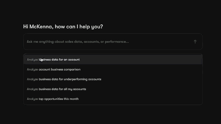
AI Generated Insight
Generative and Conversational AI


To sum them all up...
We created this logo to act as a consistent 'signal' for our AI features. Whether a user is interacting with a chatbot or generating content, the logo provides a familiar visual cue that helps them understand the tech behind the screen. It’s been a huge step in making our AI tools feel like a cohesive part of the company's ecosystem, giving users a clear way to recognize and trust these new capabilities.
This design also pushed our design system in a new direction. By introducing a gradient treatment, we signaled a more modern and adaptive look that matches the innovative nature of AI. It showed how a little experimentation can push established boundaries while still respecting the brand’s roots. This project didn't just set a new visual standard for AI at our company; it reinforced a culture of innovation that’s really sparked my own interest in what’s possible with AI-driven design.
