
Simplifying the Complex:
A Scalable Redesign for Amway’s Global Business Site
WEB DESIGN / USER RESEARCH / DARK MODE / AI INTERGRATION
.png)
01
Project Overview
Timeline
Incrementing design-based releases over 12 months
My Role
UI/UX Designer
Constraints
Changing requirements
Short turnaround
Multi-channel communications
Limitation of Design System
Problems
MyBiz is the central platform for millions of Individual Business Owners (IBOs) globally. However, before the redesign, users needed to switch between two separate websites and a mobile app just to track performance and manage their business. This fragmented experience led to slower workflows and friction in day-to-day operations. On top of that, business owners were struggling with data inconsistencies, an outdated and non-responsive interface, and overwhelming information density. Many problems surfaced during our research, making it difficult to quickly understand how their business is performing.
Goals
Our main goal was to replace our disconnected legacy tools with a single intuitive platform. We wanted to move away from scattered data and build a cleaner, more intuitive interface where the information hierarchy actually made sense. The idea was to give ABOs a single place to quickly check their performance and take action with confidence, without having to jump between different systems.
.png)
02
Challenges
HERE ARE THE PROBLEMS WE MUST SOLVE
Problems we discovered during current tool exploration
Outdated UI patterns / Unresponsive design /
Multiple logins / Inconsistent experiences
OLD CorePlus Landing page

OLD MyBiz Landing page

Data Overload / Poor information hierarchy and navigation /
New users unable to understand where to start
OLD CorePlus Incentive Page (Example)

OLD MyBiz Award Page

WHY SOLVING THIS WAS DIFFICULT?
Now that we've learned the issues with the current tools, what are the barriers to success?
Need to stay within legacy global design system
/ How might we modernize the UI without breaking global consistency?
High-density business data needing prioritization
/ How might we condense large datasets into scannable insights?
Localization requirements (language expansion, layout breakage, culture variance)
/ How might we design scalable components for global localization?
Limited business model knowledge
/ How might we learn and understand complex business structure before we dive in?
.png)
03
Research
BEFORE WE DIVE INTO DESIGN...
How can we make sense of a complex business model?
Amway’s business ecosystem is dense. We can break down all sorts of information whether it be layered incentives, or monthly and annual performance metrics. Without the opportunity to talk straight with the target users, our first challenge was building a foundational understanding of what they care about and how they interpret this complex data.

To ground our decisions, we worked closely with cross-functional partners to refine existing personas and update journey maps. These artifacts became our compass for understanding user motivations and identifying what truly matters in their daily workflow.
UPDATED PERSONAS AND JOURNEY MAPS
Our refined personas grouped ABOs into four levels that reflect where they're at, what their goals are, and focus areas:
New Business Owners
Still learning the business; need clear monthly earnings and simple breakdowns.
Leaders
Manage teams and rely on both monthly and annual incentive metrics to evaluate performance.
Business Builders
More experienced; focused on growth KPIs and tracking month-over-month progress.
Leaders of Leaders
A small, seasoned group managing multiple leaders, prioritizeing high-level trends and annual structures.
These personas highlighted a key truth: each level requires different information to understand and grow their business. A single universal dashboard would never work.
By mapping these personas to their journey maps, we identified distinct patterns in how each group engages with business data. Regardless of experience level, ABOs primarily visit the platform to:
Check income / Understand what actions they need to take / Manage their team or groups
However, the way they interpret income and action items varies dramatically.
Defining Our Direction Through Opportunities:
Personalize dashboards for each ABO level to surface the most relevant monthly or annual metrics.
Separate monthly vs. annual incentives, since only high-level leaders rely on annual structures.
Consolidate data into a single, trustworthy source, replacing the fragmented experiences of the past.
Clarify information hierarchy to reduce noise and make dense business data digestible.
Update the UI to modern standards while respecting global design system constraints.
.png)
04
Solution
WHAT WE LEARNED FROM USER RESEARCH
From Ambitious Concepts to a Focused MVP
Early brainstorming led to ambitious ideas: predictive insights, deeper incentive visualizations, AI integration, and more advanced performance analytics. These future-state concepts showed the long-term potential of the platform.
However, given timeline and team constraints, we shifted toward a Minimum Viable Product (MVP) that would deliver impact quickly while laying the foundation for scalable enhancements.
Our MVP direction focused on:
A personalized, role-specific dashboard
/ Leaders can access Annual Dashboard for Annual incentive and data.
Consolidated and reliable data presentation
/ Sunset old sites and build trust with the users.
A modernized UI aligned with the global design system
/ Strike the right balance between innovation and existing components.
Enhancements to additional key pages across MyBiz
/ Make sure all pages across the site are cohesive during navigation.
This approach allowed us to deliver immediate improvements while creating a flexible structure for future iterations.

SIMPLIFYING THE COMPLEX
Personalized Dashboards
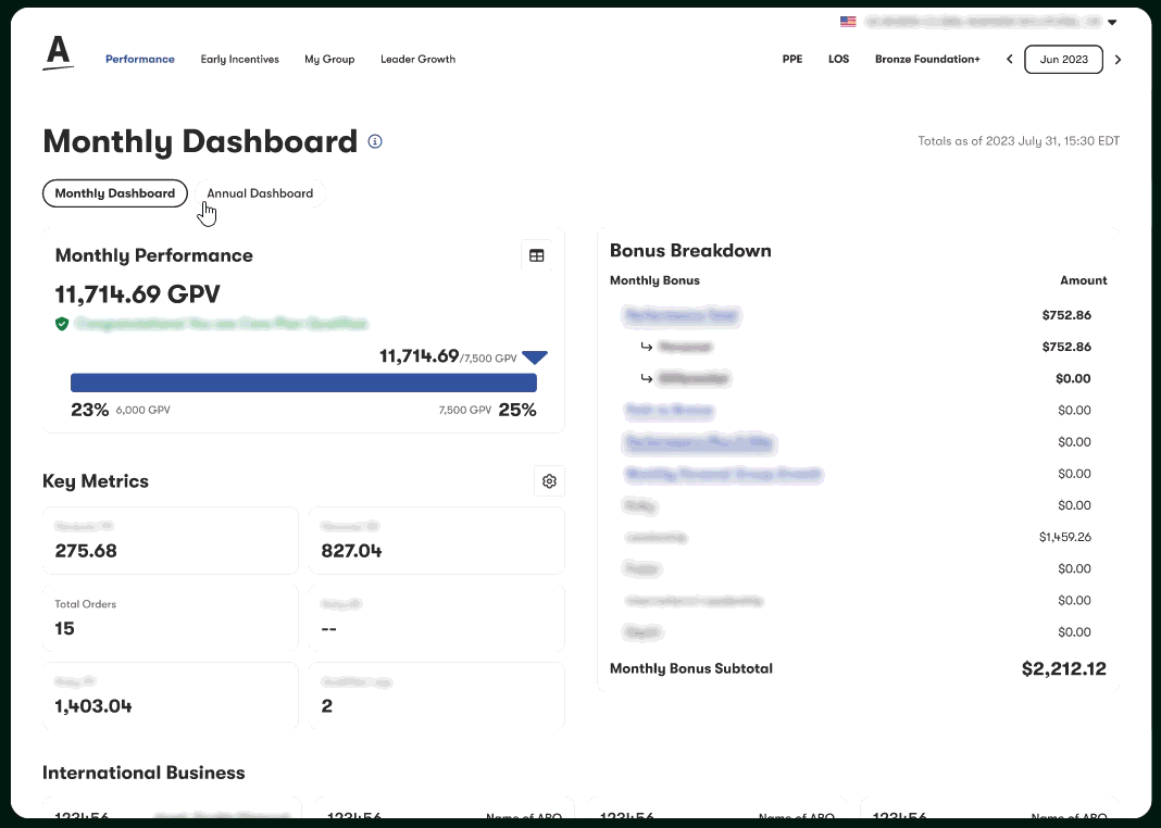
We redesigned the landing experience around user personas. Different levels of ABOs now get dashboards tailored to what they actually need, instead of a one-size-fits-all view.
The bonus panel now surfaces performance and outcomes together, with clear links to dive into details. It’s structured so users can find layered data without digging.
SIMPLIFYING THE COMPLEX
My Business Income (MBI)


The income graph was one of the most complex components. We stripped it back and made it mobile-friendly, while still allowing users to interact with data to see trends and changes.
SIMPLIFYING THE COMPLEX
Unified Navigation & Business Selector
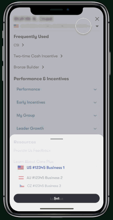
Navigation was redesigned with clarity and efficiency in mind. The updated business switcher is integrated into the header, allowing users to toggle between different businesses effortlessly. The overall navigation now supports all breakpoints, delivering a consistent experience across desktop, tablet, and mobile.
SIMPLIFYING THE COMPLEX
Incentive Pages Revamp

Incentive pages were dense and hard to use. We restructured them, and added visual progress tracking to help users read the data more efficiently. We also wanted to make sure everything aligned with the larger site design so users don’t feel like they’re jumping between different tools.
SIMPLIFYING THE COMPLEX
Earnings Calculator
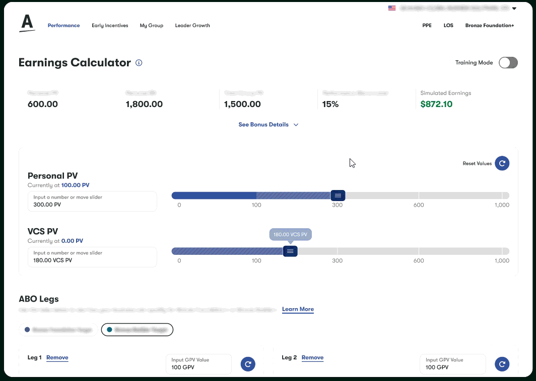
Earnings Calculator got a full overhaul. Users can now tweak inputs easily, see results instantly, and use the floating summary bar to keep key metrics in view while adjusting scenarios.
05
Outcome and Impact
Serving 55M+ global views across 63 markets
Redesigned Amway’s core business platform, used daily by millions of Independent Business Owners (IBOs) worldwide. This redesign unified content and tools from previously fragmented sites into a streamlined experience.
Elevated the design system with new visuals
Designed custom data visualizations and progress trackers. These patterns were integrated back into the design system and adopted across multiple company platforms.
Boosted satisfaction score to 4.6
Refined navigation, incentive tracking, and overall usability. The global user experience score across web and mobile was raised, with improved accessibility and consistency.
Built for scale, but designed for clarity
Balanced dense metrics and performance data with thoughtful hierarchy, making business-critical insights more readable and actionable across all device sizes.
06
Reflection
Learning to Navigate Complex Systems
Amway’s business and incentive structures are incredibly dense, especially when you’re starting from scratch. Even after a lot of research, it was tough to wrap my head around the logic, or figure out how to simplify it for users. I realized early on that I couldn't just dive into mockups; I had to really map out how the systems connected and where people were actually getting stuck. Embracing that learning curve was huge. Asking the 'dumb' questions early and leaning into every conversation helped me make much more thoughtful design decisions down the road.
Handling Shifting Requirements and Keeping Developers in the Loop
Once we wrapped up the first batch of designs, priorities started shifting fast. The page list grew and constant tweaks started popping up daily, with some being tiny and others being much more massive. In a fast-moving cross-functional team, things can get messy in a hurry for developers trying to keep up with shifting comps.
There were moments early on where I would make an adjustment and forget to flag it, which only led to confusion later. I learned pretty quickly that I shouldn't rely on my memory. Even the smallest change should get a note, whether it is a Jira comment or a quick sticky in Figma, it makes a significant difference to the developer team and cuts out unnecessary back-and-forth. It is all part of learning how to move with the chaos without letting the chaos run the process.
